Tuesday, January 20, 2015

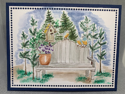
Manly card for sketch challenge Mojo 381

I am always in need of manly cards as we have a large number in this family.  I sorta feel like I went against the flow with this one,  Seems all the other cards are springy and colorful.  I tried to give depth with the different colors of browns which all come from Stampin' Up. The stamp is not from stampin' up but I added the pine tree from lovely as a tree (Stampin' Up) to the foreground and the distance behind the main stamp. I think a smaller pine tree would have looked better in the background what do you think?  If I make it again or one similar I'll have to see if I have something smaller.  I would love to read your comments on this one, even a tip on how to take a picture without getting a flash mark on the glossy card stock would be appreciated.
Card Base Early Espresso, Whisper white layer next, Baked Brown Sugar cd. stock was ran though the big shot with the Woodgrain Embossing Folder then lightly sponged with Baked Brown Sugar to make it stand out a little better.  The DSP strip is from the 2013-15 In colors - baked brown sugar, Glossy white for focal panel.
Ink:  Early Espresso,Chocolate Chip, Soft Suede, Baked Brown Sugar, Crumb Cake ( I used just a little pumpkin pie and so saffron to give a golden glow to the image not sure it comes through in the picture)
close up

Occasions and Sale-a-bration time!!!!

I'm done canning for the evening 42 quarts of chicken and broth!  that will be some good eating for us in the future.  I'm going to have this post come up on Tuesday but I'm writing it up on Monday.  The card I have to show you today is for my party at Sharon's. We will be kicking off the Sale-a-bration/Occasions Catalogs. sale-a-bration will run through March 31st this year that's 3 months to plan and be able to get  free merchandise from that catalog.  I used the Painted Petals stamp set and  
 the Spring flowers Embossing Folder from the Occasions catalog. then the Irresistibly Yours Specialty Designer Series Paper( that can be colored in a variety of ways to match your card color design!!!) from the Sale-a-bration catalog which can be gotten free with a qualifying order.  Blush Blossom, Pear Pizazz, and Whisper white card stock and inks were my color choice.  What do you think? thanks for stopping by and taking a peak here at Vicki's Visions.

Friday, January 16, 2015

Another combo: CCMC338 & PPA 236

Okay I did some stamping today before I get into the canning of my old layers this weekend and next week.  I started by sitting the CCMC colors on my desk and just sitting there looking at them.  Bermuda bay, Calypso Coral, and Crushed Curry.  I've been wanting to use the Hexagon Hive Thinlit die lately so I combined it with a sell a bration set.  Great Friends are a blessing in our live and I'm so glad I have some, guess I'll have to find just the right friend to send this to everything on this card is Stampin' Up  Now is a great time to join or have a party as the free sets in Sale a bration are available not!!  and the new Occasions catalog is out and really has a nice variety in it.
Ink and Card stock colors as stated above and shown below with whisper white.
Stamp Sets  Honeycomb Hello, SAB - Simply Wonderful (set of 6 words and a small flower)
Accessories:  Hexagon Hive Thinlits Die (love how quick and easy these are to use!!),
                        Calypso Coral Bakers Twine.  Flowerpot DSP


  I used the sketch from the...                                                       and this is the color challenge.
CCMC338PPA236
Thanks for stopping by I pulled this card together fairly quickly, in about a half hour.  What do you think of my vision?  I love to read comments, so give me some feedback please and you never know you might become that great friend. :)


Wednesday, January 14, 2015

Card class #2

Here is the 2nd card made at the card class this week. If you saw the previous post then you know that I had decided to try something different with that card.  Because of that I kept this next card pretty straight forward, quick, and easy.  It is a single layer card other that the punched butterflies.  (The new style punches are easier for them to use but I often end up punching for them.)
Whisper White card stock
Ink:  Strawberry slush, Pacific point, Daffodil delight, Garden green
Rhinestones on the butterfly to add a little pop
I won't be back for a few days as we are getting our old hens butchered and I'll be canning them the end of the week/next week.  Have a wonderful day and thanks for any comments made and for stopping by and looking.

Card class #1

I have a card class this week -  here is one of the cards I hope the ladies will make.  Time will tell if I can get there or not, we live back a long lane that will drift and although the guys can get in and out with their 4 wheel drive trucks my husband tells me I shouldn't try with the van yet. He did scrape the lane some on Saturday so maybe!!!
      I keep things pretty simple and more often than not use retired supplies for this group as it take a while for them to do it all. I'm going to try something a little different with this card, I have a variety of washi tape, glittery hearts and other Valentine type embellishments in a tub and thought after we stamped the heart background (retired stampin' up) and the hearts on the top panel(also retired) I would give them freedom to make the card look like they wanted.  It might be the first and last time to try something like this or I may try to do something like this more often.

Monday, January 12, 2015

Techno Stamper challenge #349

This year one of my wishes for myself is to enter more challenges.  It will keep me stamping and  challenge me to sometimes think out of "MY" box so here is the 2nd today. I'm home bound and couldn't think of anything better to do while doing laundry than stamping!!  
      I thought with Valentines Day coming up that I need some cards for the men in my life, I have a Wonderful Husband and 4 terrific sons AND  in the last year and half I've added a daughter-in-law and a super cute Grandson!!   
      I have been wanting for some time to make a shaker card, I hope the different sizes of hearts is okay for this challenge, When I finished the card I realized that maybe I should have used the DSP behind the heart shaker I used white thinking it might pull the white dots out on the DSP  oh well  
I used Rich Razzleberry for the card base, Put a natural DSP layer on that I ran through a homemade embossing piece.(don't have my occasions order yet)  Then I used the Occasions paper piercing pack to go around the hearts that are indented on the DSP piece (doesn't show in the picture very well)  The border on the card and on the edge I punched with a heart border punch that I have from Knock Outs.  The shaker heart was made with the heart framelits, shaker frames cut and formed around the heart shape, the little hearts in the frame are from the border punch and one larger heart from the itty bitty punch pack.  The only stamping on this card (unusual for me) is the I and U in the I heart you sentiment.  
As I look at it now I kinda wish I had used a more vibrant pink for the borders. I guess that's the way is goes sometimes...  what do you think?  Thanks for stopping by and seeing my Vision! 


Challenge combo!! Colour Q and Sweet Sunday

I had every intention to stamp on Sunday and work on the Sweet Sunday sketch challenge but I got sidetracked.......

Sooo I worked on the sketch today... Monday.   I decided I wanted to try my hand at combining 2 challenges again as I haven't done that in a while This is a combination of Sweet Sunday Sketch and Colour Q #274.  so with that I present you with Vicki's Vision.....


Inside of card
close up  


Here are the 2 sites and their challenge sketch/colors!! 
Recipe:
 All Stampin' Up(except inside embossed piece)
Stamp Sets:   Corner Garden, Lovely Romance
Colors Ink and Card stock as stated above in the challenge.
I used the markers and blender pens to add the color to the crumb cake piece that I stamped with the corner garden.  I stamped it twice as I knew I wanted to pop the flower as the sweet Sunday sketch needed that.  After using the blender pen I went over certain areas with the marker fine tip to make it look shaded.  The big flower I added dimensionals to and popped up, I also added crystal effects to make it shine.   The DSP paper is from the Back to Black that I sponged with the Rich Razzleberry color.(I really like this paper but seems I'm always adding color to it to go with what I'm working on do you do that?  or is it just me?)  
     
I love to hear what others think of my Visions and I will have to find someone Amazing to send this to.  Maybe it will be you!!  :)        

Friday, January 9, 2015

Watercolor #3

last of the Impression Obsession stamps used while my Big Shot was AOL is the Big City landscape.  I don't live where near a view like this. but I did visit New York once when my sister lived there so could imagine a little.  Once again I used Watercolor paper on the focal image.  That wonderful wide tip watercolor brush (!!!!) was used on the background. I masked off the water area and did the sky then masked that and did the water area.  Stamped the "big city" across the horizon,  stamped again on a piece of acetate then rubbed that in the water area right below the stamped image to create the reflection in the water. It really is easy!!  if you don't have any acetate you could cut a piece of heavy plastic (like a piece of clear plastic that a mans shirt and tie comes in) to use.  Finished the card with layers, ribbon and photo corners.  I thought it looked pretty good, what do you think?  Love to read comments.
          I now need to get ready for a stamp event next Tuesday so I better get to crafting, My Big Shot came home!!  :0)

Wednesday, January 7, 2015

Watercolor #2


Impression Obsession - 2 images  the mountains in the background and the light house  
I used watercolor paper on the top focal panel,  Masked the bottom  off to do the sky then removed and did the water area.  A variety of colors used with my wide tip watercolor brush (did I mention that I'm loving it!!) stamped the mountain landscape then embossed with black the light house.  Sponged around this layer with black then put on the multiple layers (hello honey, basic gray, very vanilla then basic gray)  added hello honey ribbon to left side to balance. This is a 6 3/4 x 5 1/2 card.

Monday, January 5, 2015

No Big Shot so I watercolored!!

Okay so my Big Shot has been loaned out since the week before Christmas and I heard my craft room calling to me and since I had no Big Shot I decided to do some water coloring with some scrap water color paper I had laying around.  Then I pulled out a stamp set that hasn't been used yet.  If you look at the set and say I have never seen that on in Stampin' Ups catalog that is because it isn't in it.  I bought it last fall when I went to Cincinnati with a friend.  It is a set of 11 stamps that are all landscapes of a variety of country scenes.  Here is one and if you check back you can see a few more in the next few days.
The piece with the barn scene reminds me of my home since I live on a farm.  I water colored the sky with  my wide tip watercolor brush then heat embossed the barn scene with black.  added the ribbon which is retired and added the beautiful thank you script(non stampin' up).  I really enjoyed useing the wide tip water color brush on all three of the cards I will be showing in the next few posts.   Thanks for stopping by and I love reading your comments.

Just because cards

 I have been wanting to use some of my Art Impression Stamps lately and decided that today was the day. I used a new set, It’s one of the wa...